 |
| Tj Schiller pro ski design |
 |
| T shirt design for a charity project curated by his friend Brandon Ilenstine |
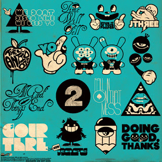
Jared Nickerson is a 26 year old illustrator based out of Seattle, WA and has been in the industry 5+ years.
Q. Considering how many tees you’ve done in the past yourself and witness so many at lafraise.com, how do you approach a new design? What do you think works / doesn’t?
A.Honestly you’d think there would be a science to it, but essentially there isn’t. Depending on the community and area of the world, certain things work and don’t work. Some communities love their character designs, others like their big abstract prints, while others even like their tshirts with a “punchline”. What I find works best for me though is an assortment of elements mixed together. Those seem to be my most popular designs
Q. As well as tees, you’ve got your work plastered all over Ryzwear sneakers, hoodies, websites and even ski’s. Would you recommend up and coming illustrators to stretch their design skills and work to these different canvases?
A. Essentially in any design industry it’s great seeing your work on any medium. I definitely suggest experimenting with different companies. It really helps reach new audiences as well. People that might be avid skiers would have never seen my work if it wasn’t for their favourite skier using a pair of my skis, the examples can go on. Essentially the more platforms and mediums you use, the better coverage you get.
Q. Your logo work is excellent too, the majority of your approach to logo design goes against the grain of standard identity design, being quite detailed, intricate but yet quite beautiful. What do you consider your favourite logos, and do they influence your logomarks?
A. Logos are one of my least favorite things to design/illustrate. I always find it’s too much pressure to sum up a whole company or organization in one simple graphic. I think my favorite logos though are the ones that are a small artwork in themseles. Ones that tell a short story, instead of just a letter in a box. Mind you, the logos that seem to work the best are the ones that are the simplest. Someone mentioned to me that the best logos, are the ones that anyone could recreate on a napkin. That shows true branding.
more of his work can be found here http://www.jthreeconcepts.com/#
/

No comments:
Post a Comment